Elevated death rate due to infection
elevated_death_rate_infection.Rmd
library(seropackage)
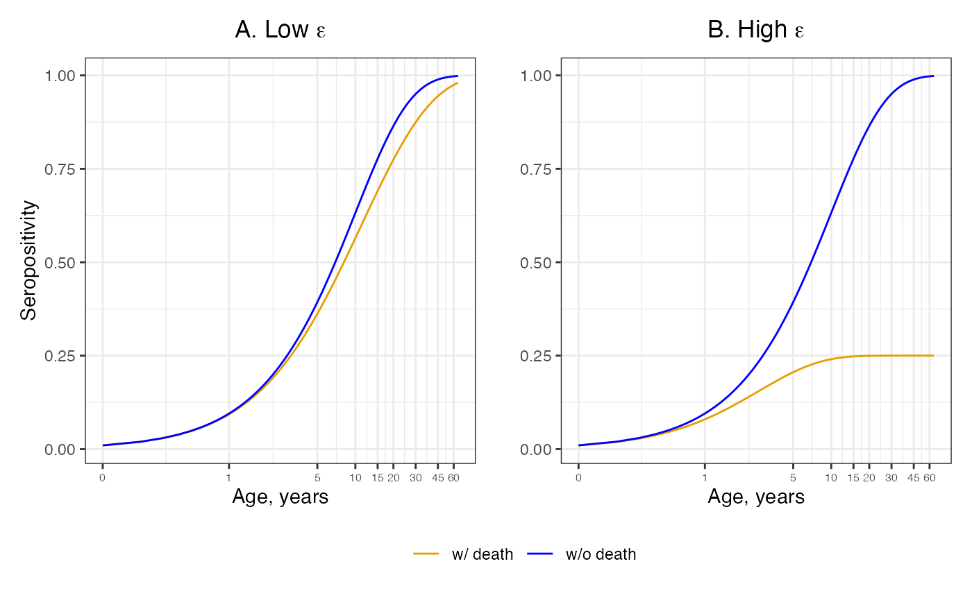
knitr::opts_chunk$set(echo = TRUE)In this article, we assume differential mortality by including an additional death compartment to the age-dependent FOI model. We assume a constant FOI which is indepedent of age and time.
# functions for the system equation solutions:
constant_foi <- function(a, lambda, epsilon){
  # seropositive proportion v1 == includes death
  prop_x = 1-((lambda-epsilon)/(lambda*exp((lambda-epsilon)*a)-epsilon))
  # seropositive proportion v2 == constant FOI
  prop_x2 = 1-exp(-lambda*a)

  return(c(prop_x, prop_x2))
}

ages <- seq(0.1,65,by=0.1)
Scenario where there’s low risk of death due to infection ( = 0.05) and the force of infection () is assumed to be constant ( = 0.1) in both panels.
epsilon <- 0.05; lambda = 0.1
prop_seropos_df <- data.frame()
for(age in ages){
  out = constant_foi(age, lambda, epsilon)
  prop_seropos_df = rbind(prop_seropos_df, c(age, out))
}

colnames(prop_seropos_df) <- c("age", "prop_death", "prop_nodeath")
prop_seropos_df1 <- reshape2::melt(prop_seropos_df, id = c("age"), variable.name = "Proportion")

figA <- prop_seropos_df1 %>%
  ggplot(aes(x = age, y = value, color = as.factor(Proportion))) +
  geom_line() +
  scale_color_manual(values = c("prop_nodeath"="#0000FF", "prop_death"="#E69F00")) +
  labs(x = "Age, years", y = "Seropositivity", title = expression(paste("A. Low ", epsilon))) +
  guides(color = "none") +
  scale_x_continuous(trans="log10", breaks = c(0.1,1,5,10,15,20,seq(30,70,by=15)),
                labels = function(x){sprintf("%.0f", x)}) +
  theme_bw() +
  theme(plot.title = element_text(hjust = 0.5),
        axis.text.x = element_text(size = 6))
Scenario where there’s high risk of death due to infection ( = 0.4)
epsilon <- 0.4; lambda = 0.1
prop_seropos_df2 <- data.frame()
for(age in ages){
  out = constant_foi(age, lambda, epsilon)
  prop_seropos_df2 = rbind(prop_seropos_df2, c(age, out))
}

colnames(prop_seropos_df2) <- c("age", "prop_death", "prop_nodeath")
prop_seropos_df3 <- reshape2::melt(prop_seropos_df2, id = c("age"), variable.name = "Proportion")

figB <- prop_seropos_df3 %>%
  ggplot(aes(x = age, y = value, color = as.factor(Proportion))) +
  geom_line() +
  scale_color_manual(name = "",
                     values = c("prop_nodeath"="#0000FF", "prop_death"="#E69F00"),
                     labels = c("w/ death", "w/o death")) +
  labs(x = "Age, years", y = "", title = expression(paste("B. High ", epsilon))) +
  scale_x_continuous(trans="log10", breaks = c(0.1,1,5,10,15,20,seq(30,70,by=15)),
                labels = function(x){sprintf("%.0f", x)}) +
  theme_bw() +
  theme(plot.title = element_text(hjust = 0.5),
        axis.text.x = element_text(size = 6))
An elevated death rate subsequent to infection can dilute the pool of seropositive individuals. The orange line accounts for an elevated death rate post infection and the blue lines show the approximate solution given by neglecting to account for elevated death rate.
figA + figB + plot_layout(guides = "collect") & theme(legend.position = 'bottom')